James Billiter Studio Blog

Posts tagged Drawing
Fountain Square at Night Graphite Drawing

I’ve been working on a graphite drawing. Dusting off my pencils and skills after learning a ton in Design Drawing during my first year in design school back in 1996.

Planning to experiment to see how the graphite texture screenprints.

This image was inspired by a 5mile walk last summer with my dog Kona, where we went through Newport and Covington then visited the Square during a Hip Hop concert. I love when downtown is full of people, arts and vibrancy!


2011.37/52

Analog Analog World: Drawings of Photos I have Taken

I'm resurrecting my drawing project, turning it into a fun coloring book for my nieces and nephews. I decided to interpret some of my favorite film photographs (holgas, polaroids, 35mm, etc.) into drawings that children and adults can enjoy. I'll post more as I go!


2011.35/52

Dandy Poster Series II

This is going to be kind of like an Andy Warhol project for me. I think I can keep tweaking and refining my portrait, and I ma planning on rolling it out with different quotes and colors. Since the last iteration I have added more detail to my face and I have a second (although less sophisticated) design for the typography. The one in the middle will be a fun tweed option to be unveiled in the future.


2011.31/52

Monster of Cross Poster

I wanted to contribute to a local cause; the construction of a permanent cyclocross course in Devou Park, Kentucky. I don't have a ton of cash coming out of my pockets so I decided to set up this event and do the design for the poster.

I wanted it to be for the whole family, so I created these fun cartoon character. I wanted to continue to push my hand-drawn, from scratch, slow-design aesthetic. Unfortunately I didn't have a lot of time to finesse my work, I feel like the characters could be a bit more refined. Design and life is a process, this design is finished and I will try to improve my character design skills in future projects.


I recycled film boxes from into hand-drawn packaging! Compared to the sleek, super-marketed packages you come in contact with everyday these have a bizarre crafted feel. Like a granola version of Warhol...


2011.15/52

Analog Analog Series #2
View from Eden Park: Coloring Book Version

Last year I had a great time making a coloring book for my nieces and nephews. When I was thinking about making a drawing of my film photographs, this funny idea of a coloring book came to mind. The only downfall is that I am going to have to find imagery that kids will enjoy, while my Holgas are typically void of humans and animals — typically focusing on nature and architecture.

This image is one of my favorite views on my bike commutes to and from work. Sometimes I ride through Cincinnati's Eden Park and you can look out over a bend in the Ohio River. I stop for a sip of coffee and a quick stretch before heading into work.


2011.10/52

Analog Analog Series #1
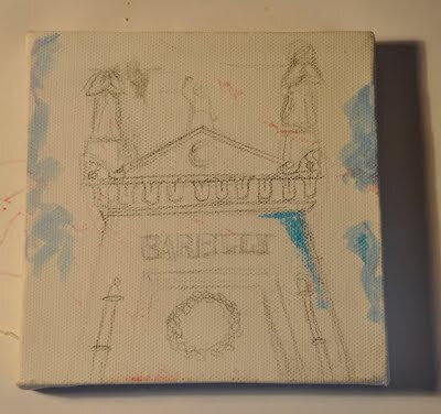
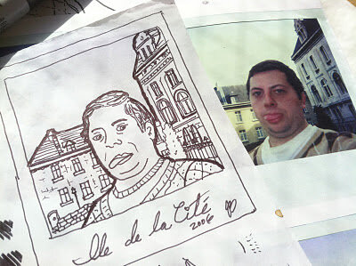
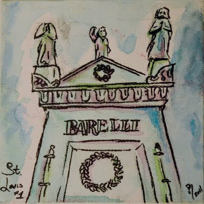
Saint Louis Cemetary Tomb

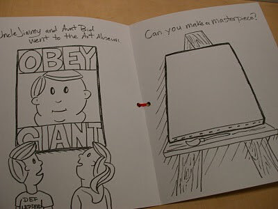
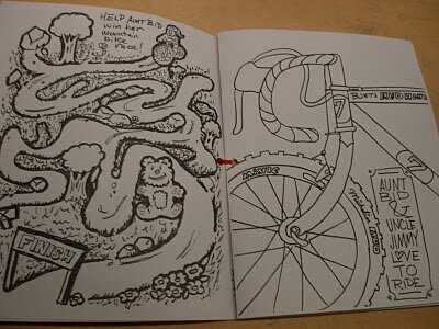
If my last post was the beginning of my "Analog World" series — then this is a spin off where I draw versions of my favorite analog photos. Applications could be paintings, coloring books, silkscreen posters...

This process of going more analog with something already analog seems unique to me because on a daily basis I create design artwork in the computer, sometimes basing it on digital photographing. It's like getting sick of racing a Ferrari and choosing to drive a horse and buggy to "find your soul"! But in all reality this is old hat to anyone practicing art more than a few years ago. In some ways I have a similar inclination to the Post Family from Chicago featured in the Typeface movie.

As you can see my hand skills need a wee bit of work but it's fun to liberate myself. On a side note, I need to up my art production: if I am to produce 1 piece of art per week for an entire year, I should of produced 15 pieces of art by now...

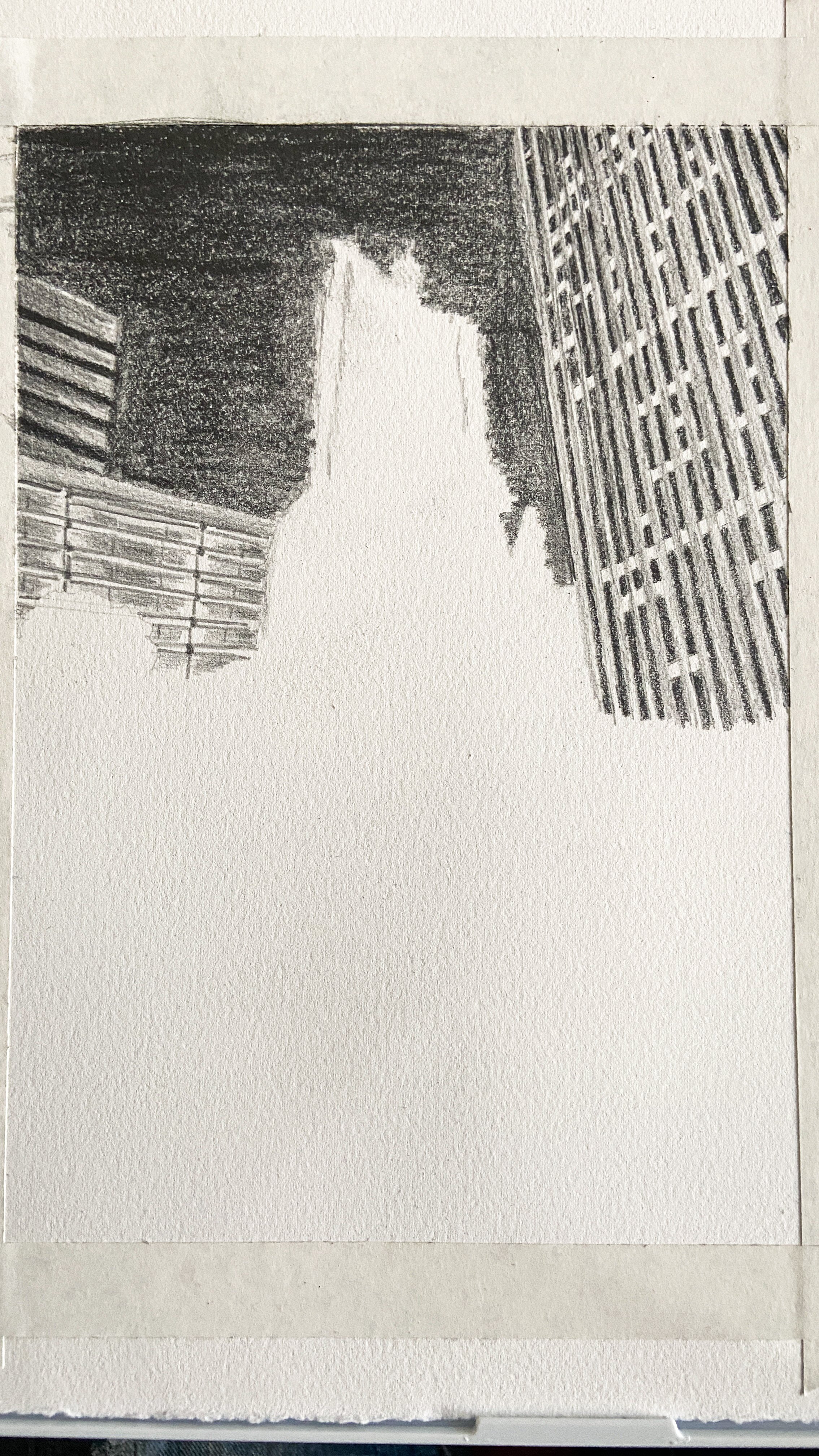
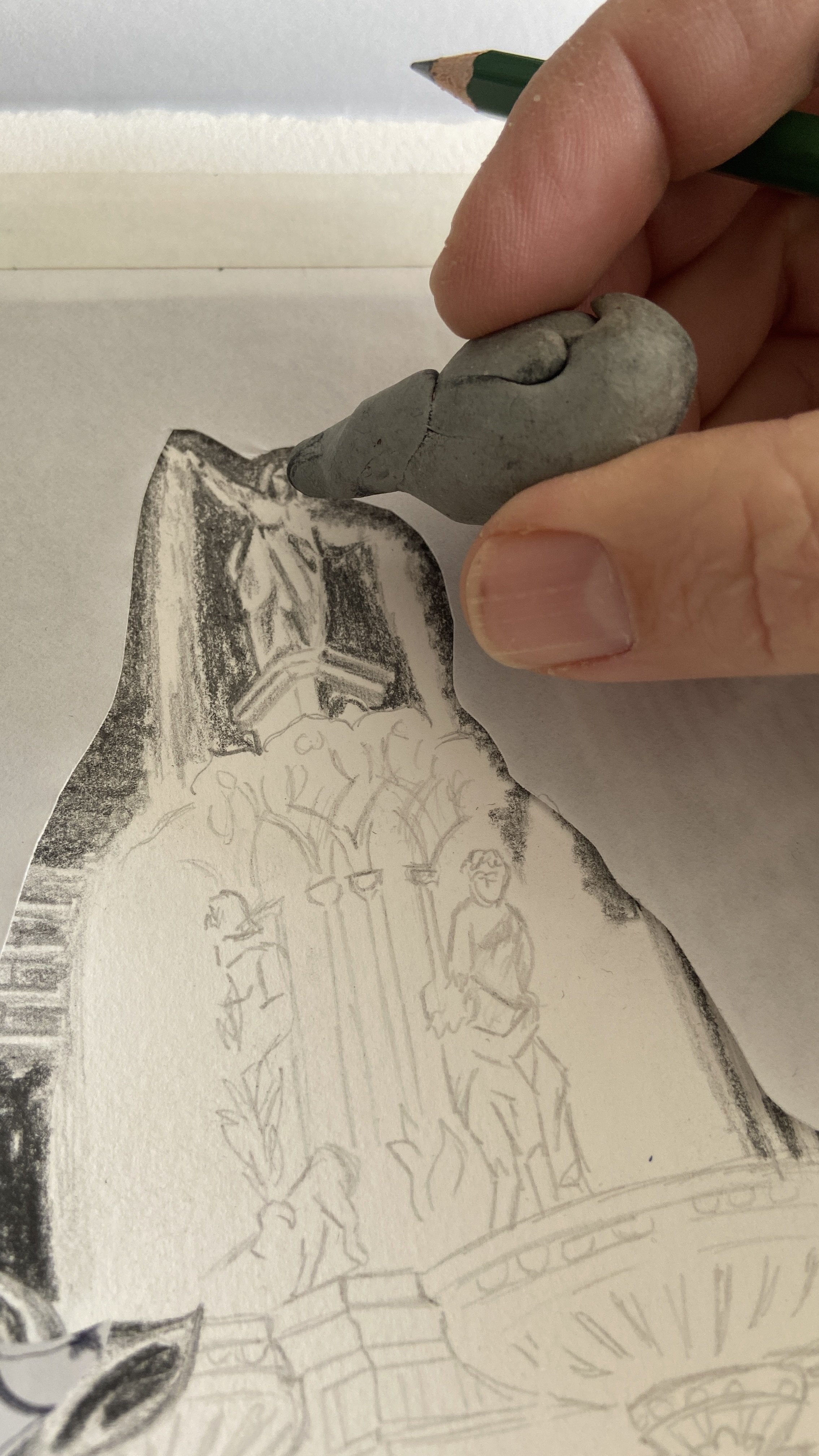
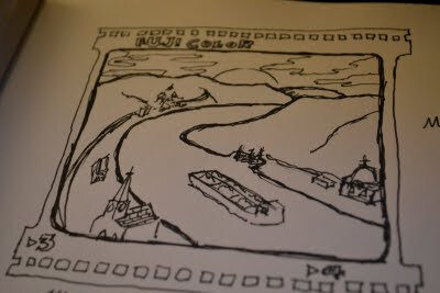
Also, here is a process pic showing my under drawing:


2011.1/52
I was inspired to make this "Kings of Cross" poster after attending a cyclocross race at the old Kingswood Golf Course last weekend. I love the image of a King holding a bike over his head while attempting to clear a barrier, kind of Picasso in its bending of perspective and Escher in its symmetry. I drew the playing card inpired art with sharpie and scanned it in to arrange the elements.

You can find more of my posters at Flickr.


I love hand-drawing my typography. It harkens back to the old days of hand-painted signs, and photostat logos and lettering. Sometimes I trace these in Illustrator and clean them up, but other times I use them in their rough state with all their humanistic flaws and irregularities.

I did a bunch of typefaces — some inspired by the title cards in Jean Luc Godard's films, some by old art nouveau perfume packaging.
This year I drew a coloring book for my nieces and nephews for Christmas. I really loved making this for them — it is rare that anyone gets to see my actual drawings as a finished product.


Cover with Animal Numbers.


Shepard Fairey even made it into the book!


I love the detail of Bridget's cyclocross bike on the right.

I think I will do this more often. It has been a few years since I have pushed myself to use my drawing and painting skills in projects.
James BilliterDrawing, Kids