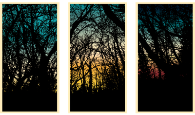
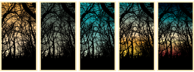
James Billiter Studio Blog


2011.14/52

Story Quilt Icons

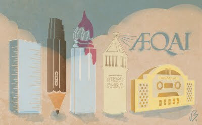
I became obsessed with making a system of icons while working on a probono project at work. This may be part of a identity system for a public works project. So often I work so diligently on something that doesn't see the light of day, and all my passion went into something I can't share with anyone due to confidentiality.

That's why I created this project (52 in 2011) for myself. So at the end of the year I can say "look at all this art/design/photo/film I created."

I love artists who are obsessed, and like Mies van der Rohe I also believe "God is in the Details." Sometimes, creatively, obsessions with styles can be costly if you miss the mark. Fortunately everyone likes this so far. Hopefully the client will too.


I've been obsessed with cuckoo clocks, chandeliers, trophy heads, etc.

I want to break out of my 2D tendencies for some future projects. One is creating my own cuckoo clock (probably not with working cuckoo *darnit*) , redesigning the aesthetic in a contemporary fashion.

I was riding my bike in the country and a light bulb turned on above my head. What about a cuckoo bird house?! I thought I was a genius until I google searched it. Darn. But maybe once I make the clocks I will create an alt version of a bird house.

Other ideas for bird houses I've wanted to make: miniature version of my house and mini-skyscrapers/skyline.

Unfortunately last year my dog died. So we tried to get out of the house a lot to take our minds off of it. We went to a boutique where I saw these wooden silhouettes of animals called "Kingdom Animalia" by a Brooklyn studio called Enormous Champion. Perhaps once I have the jigsaw out I will make a silhouette of my pet dog as a remembrance.


2011.13/52

Bird Rescue Logo

A while ago I worked on a logo for a bird rescue. Some days I feel so witty, like a freakin' genius. I noticed the serif of a B looks like a bird beak, and a R looks like a wing. So I created this fun bird icon, the top part is bird, the bottom says rescue. I thought this was clear, simple, elegant, witty. Then I got to the internal review and was blasted out of the water by constructive criticism. Wankers.


2011.12/52

Creative Juices Poster

This isn't really for anything. Someone said creative juices the other day, made me feel a little gross. This image of the c & j letterforms popped in my head and they looked a bit naughty. Perhaps some day the AIGA will need a poster for a design conference/orgy...


2011.11/52

Cincinn-ARTY

Dustin, a colleague at work curates and seeks submissions of artwork for AEQAI, an online journal of Cincinnati's visual arts.

He contacted me about created a Splash page visual for the April edition of AEQAI. I wanted to create something specific for the magazine, so the idea of Cincinnati's landmarks becoming tools for making art popped into my head. A cold modernist building like the Kroger building is a ruler, the Carew Tower is a number Ca2ew pencil, Central Trust is a can of spray paint sky-writing AEQAI, the new Great American building is a brush and Union Terminal is a boom box (part of graffiti culture and performance art). I was kind of inspired by New Yorker magazine covers.

I'm excited to be part of a group of my favorite local designers like Dustin, Keith Neltner and Tommy Sheehan.


2011.10/52

Analog Analog Series #1
Saint Louis Cemetary Tomb

If my last post was the beginning of my "Analog World" series — then this is a spin off where I draw versions of my favorite analog photos. Applications could be paintings, coloring books, silkscreen posters...

This process of going more analog with something already analog seems unique to me because on a daily basis I create design artwork in the computer, sometimes basing it on digital photographing. It's like getting sick of racing a Ferrari and choosing to drive a horse and buggy to "find your soul"! But in all reality this is old hat to anyone practicing art more than a few years ago. In some ways I have a similar inclination to the Post Family from Chicago featured in the Typeface movie.

As you can see my hand skills need a wee bit of work but it's fun to liberate myself. On a side note, I need to up my art production: if I am to produce 1 piece of art per week for an entire year, I should of produced 15 pieces of art by now...

Also, here is a process pic showing my under drawing:

I've had a really inspiring week of culture. Monday night was a visit to Cincinnati's Contemporary Arts Center to see Typeface the movie presented by the local AIGA. It's about the Hamilton Wood Type Museum in Wisconsin.


We walked around after the film and saw the current exhibits, including one on Keith Haring. I always liked Keith Haring and I would like to go again and really read into his life story and influences.


Thursday we went to a lecture by Thomas Widdershoven of the Dutch graphic design firm Thonik. Thonik does quite a lot of design for the public and his lecture really inspired some of my thinking for a small project that I am doing for a county in Ohio. In one campaign Thonik used new media and wit to revolutionize the Socialist Party in Holland.


And on Friday my photog friend Dion and I visited the Cincinnati Art Museum to see the Circus Poster Exhibit, as well as a Dutch Modern Design exhibit and the 21st Century Art.


The amount of detail and the artisanship of the Circus Posters is incredible. The old stone lithography style where they used pencils to paint on the image create some beautiful results. And they sometimes used handmade lettering and woodtype at other times. Very cool!


2011.9/52

How the West was Won

I visited Austin, Texas a little over a month ago to see my sister. We visited the State Capitol building at sunset and the light was really hitting this statue in a beautiful manner.

I shot a holga as well as the polaroid below.


I heart Kid Cudi. I love the mixing of color in this but the overall desaturated images.


This one is very Michel Gondry-esque, super cool. There is also a second version of the video that is more traditional hip hop-ish with party shots.

The "Day 'n Nite" video is sweet too with video mixing with drawings.


2011.8/52

Saint Louis Cemetary Tomb: Deaf Prayers
Holga 120mm, Custom Frame, 400sp Fuji Color, Cross-Processed in C41 chemicals.

I have always loved photography. It was a real pleasure to learn how to develop my own film, setting my shutter speed/exposure settings. Sometime around 2002 I embraced film again as a reaction to poor quality in inexpensive digital cameras. Then I was introduced to Holgas and Polaroids. My interpretation of these tools was that they were punk, lo-fi and DIY — and the grit, blurriness and light leaks reminded me of the poorly transferred French films I watched as a teen.

Film makes you focus (no pun intended). You got 10 Polaroids, 12 Square Holgas. Is this shot going to be worth the cost? In 2006 I went to Europe with only a Polaroid — I didn't want to live behind the camera lens. Sounds nice. In theory...

My lovely wife and I just went on a trip to New Orleans. I new there would be killer scenes to photography. I went overboard and took three cameras: my new digital SLR, my Holga and Polaroid.

Someday I hope to compile these photographs into an exhibit. My working title is currently "Analog World."

Just some designers and their projects that have been inspiring me lately:

http://statemottosproject.com/gallery/

http://www.danielraycole.com/

http://www.mikeyburton.com/

http://YoungJerks.com/#598329/God-Bless-The-Midwest

http://www.pencilpluspaper.com/


2011.7/52

In A Rut

I'm not super sure about this one yet... It's an amalgamation of Nikki McClure and Michael Schwab...

The idea is create a strong image of a rider riding through a muddy/icy rut. An image that could be easily manipulated by the colors chosen for the silkscreen — feeling like winter using blue tones or late autumn using browns.


2011.6/52

For the past few months I have been creating my own typography out of simple Illustrator stroked paths. The effect is a very fun and friendly typestyle.


2011.5/52 Snowy Creek

I've been playing a lot outside — cycling, running and hiking in the snow. I find the snowy woods really beautiful and I am grateful I live in a pace that gets al four seasons and that we have had a lot of snow for the past two years.

These shots are from a few weeks ago. I was inspired by a Holga I shot two years ago and I hope to convert these pics into a cool graphic landscape (see Holga and an old poster I created below).


2011.4/52 Winter Sunsets

I was walking my dog in the woods and I was really inspired by the stark contrast of the bare branches and the progressing sun setting on the horizon. I took a photo and extracted the branches — intending to make a silkscreen plate from this. This one plate with a dark brown or black ink could be printed over various skies made by smearing ink and/or printmaking.

I would see this as a continual scene (tryptich) or one cropped scene printed over a series of skies. This silkscreen plate would also be cool if I traced the photograph in ink — giving the branches and trees a rougher impression.


I just heard of this band. I really dig their sound, super chill like a psychedelic StereoLab.
James BilliterMusic


2011.3/52

A couple weeks ago I took advantage of a gloomy morning to capture the bar down the street from where I grew up. There were times in the past where it was notorious for being rough — so I played up an underlying sinister feeling in my photography.