


1
2
3
4
5
6
7
8
9
10
11
12
13
14
A passion for letterform design and custom type with a career focused in identity and branding.
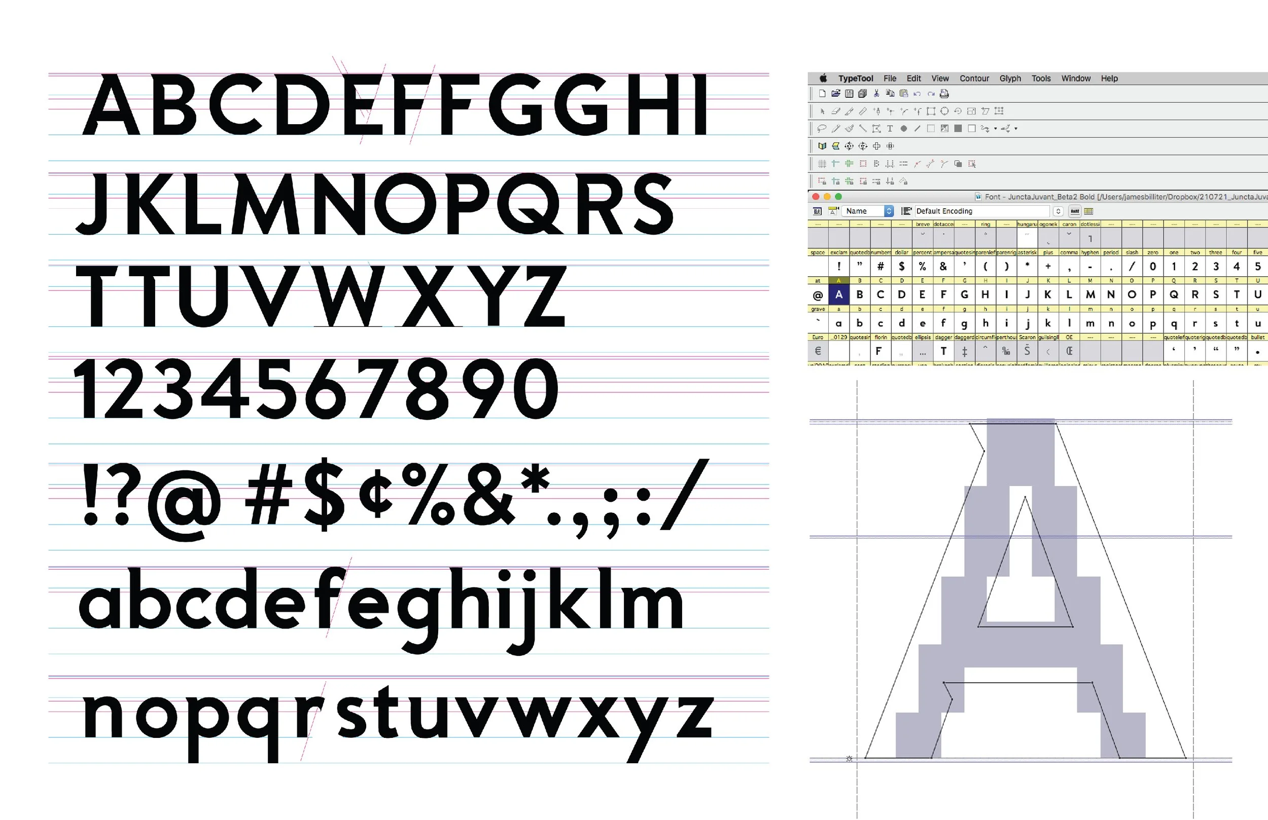
Client: University of Cincinnati
Tower of Strength Font
Adapting custom letterforms from Identity design into a custom font for the client. For this project, I created the letterforms in Adobe Illustrator and imported into Fontlab’s TypeTool. Began using Fontographer in the late 1990s and am currently learning Glyph.
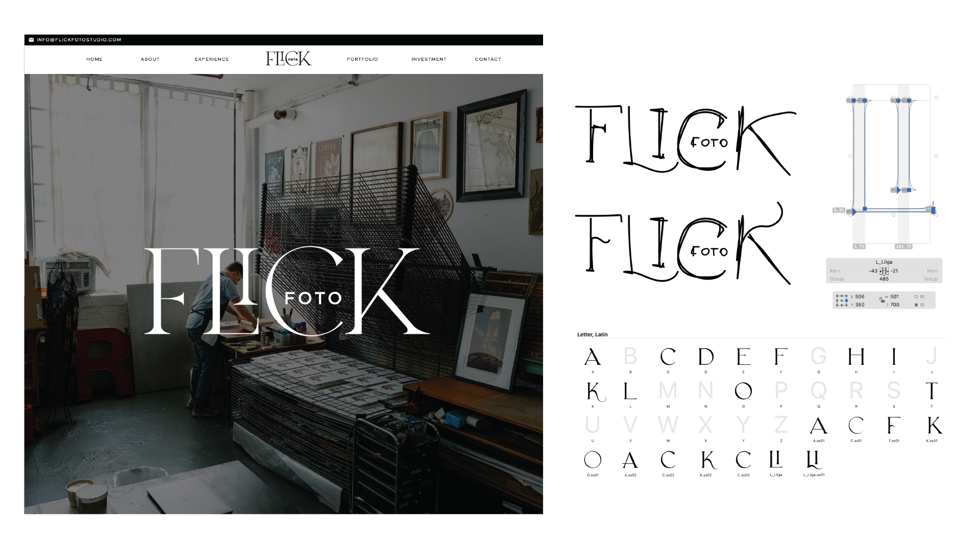
In 2024 I developed a logo for Flick Foto as they pivoted their business to new audiences in bridal and corporate photography. Inspired by a contemporary trend that reference the elegance of the Art Deco era, I used the iPad to quickly sketch ligatures and letterforms. I used the Glyphs Mini application to develop letterforms that merge elements of Art Deco and Art Nouveau design movements. Drawing letterforms in Glyphs allows for a quick and simple vector adaptation of the lettering sketch, as well as I can quickly develop the "DNA" of a font and how the letterforms reference each other.
An unwound cassette inspired this playful script developed for Hubbard/2060 wall graphics.
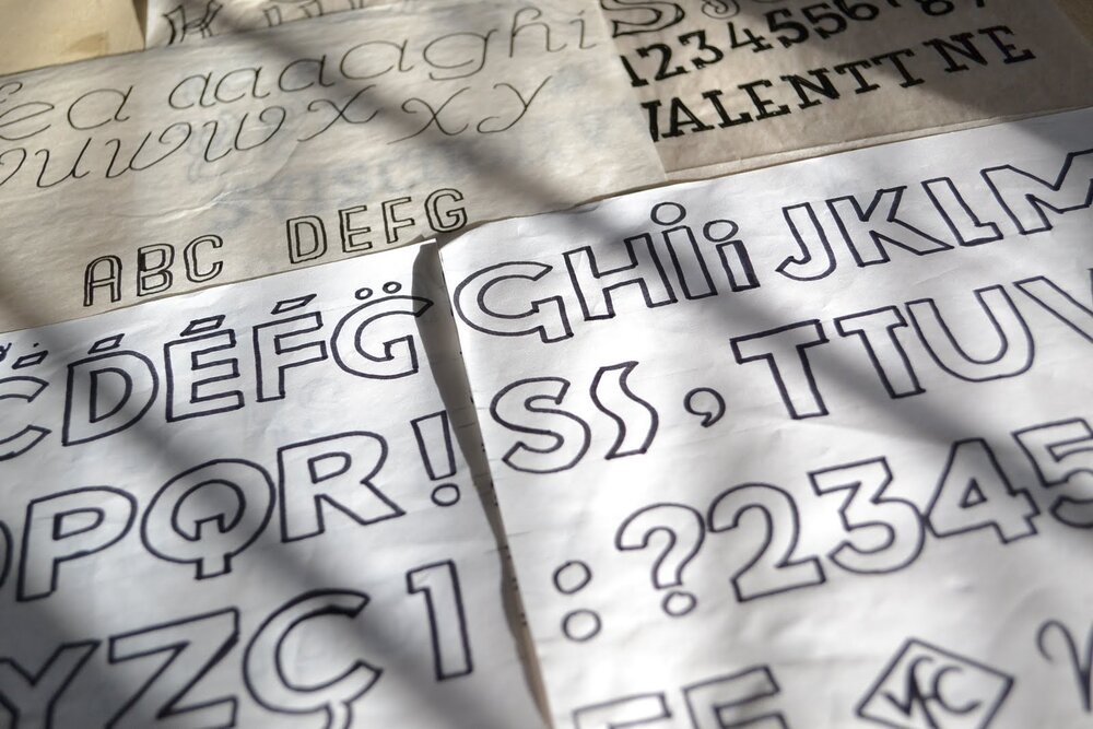
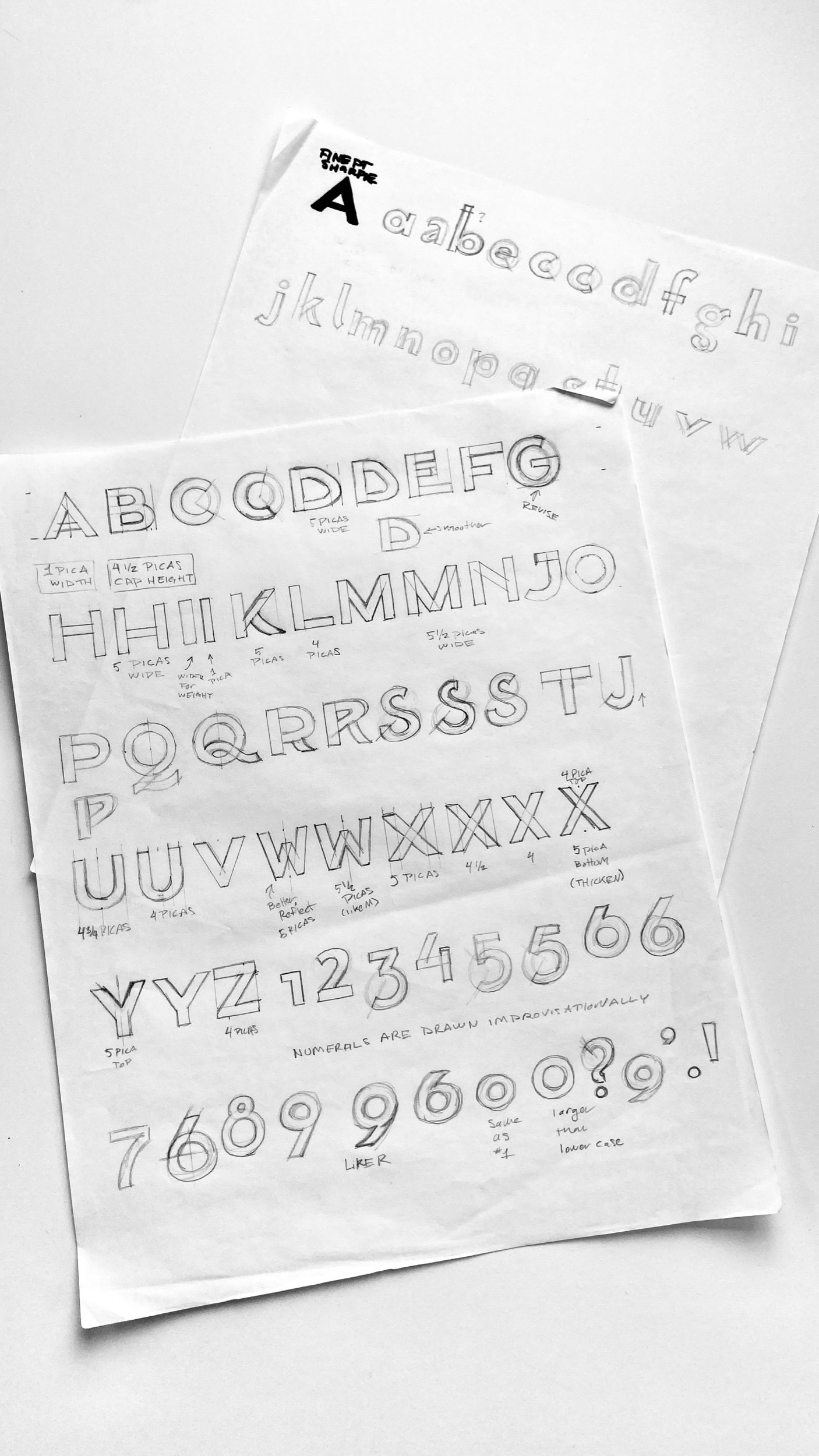
A variety of hand-drawn letterforms on marker paper circa 2010-11
My first letterforms from Type Class in 1997— a throwback retro sans serif! hand-painted with Plaka!
I fell in love with type design then and always enjoyed creating letterforms since then.